API Reference
A list of components, hooks, and constants provided by @xrift/world-components. These can be used from both world and item development (world-only items such as SpawnPoint / DevEnvironment / useSpawnPoint are called out on each entry).
Components
Interactable
Creates an object that can be clicked/interacted with.
import { Interactable } from '@xrift/world-components';

<Interactable id="my-button" onInteract={() => console.log('clicked!')}>
  <mesh>
    <boxGeometry args={[1, 1, 1]} />
    <meshStandardMaterial color="hotpink" />
  </mesh>
</Interactable>
Props
| Prop | Type | Default | Description |
|---|---|---|---|
id | string | - | Unique identifier (Required) |
onInteract | (id: string) => void | - | Callback on interaction (receives the object ID) |
interactionText | string | - | Text displayed on hover |
enabled | boolean | true | Enable/disable interaction |
type | 'button' | - | Object type |
children | ReactNode | - | Object to be interacted with (Required) |
Mirror
Creates a real-time reflective surface.
import { Mirror } from '@xrift/world-components';

<Mirror position={[0, 1, -5]} />
Props
| Prop | Type | Default | Description |
|---|---|---|---|
position | [number, number, number] | [0, 0, 0] | Mirror position |
rotation | [number, number, number] | [0, 0, 0] | Mirror rotation |
size | [number, number] | - | Mirror size [width, height] |
color | number | 0xcccccc | Reflection color |
textureResolution | number | 512 | Reflection texture resolution (auto-adjusted by size ratio) |
lodDistance | number | 10 | Distance in meters to switch to envMap-based pseudo-mirror |
VideoScreen
Creates a screen that plays synchronized video.
import { VideoScreen } from '@xrift/world-components';

<VideoScreen
  id="bg-video"
  url="https://example.com/video.mp4"
  scale={[4, 2.25]}
/>
Props
| Prop | Type | Default | Description |
|---|---|---|---|
id | string | - | Unique screen ID (Required) |
position | [number, number, number] | [0, 0, 0] | Screen position |
rotation | [number, number, number] | [0, 0, 0] | Screen rotation |
scale | [number, number] | - | Screen size [width, height] |
url | string | - | Video URL |
playing | boolean | true | Playing state |
currentTime | number | - | Playback position in seconds |
sync | 'global' | 'local' | 'global' | Sync mode |
muted | boolean | false | Muted state |
volume | number | 1 | Volume (0-1) |
VideoScreen is a simple screen without UI controls. Use VideoPlayer if you need play/pause buttons or a progress bar.
VideoPlayer
A video player with UI controls based on VideoScreen. It features VR-compatible control UIs such as play/pause buttons, progress bar, and volume bar.
import { VideoPlayer } from '@xrift/world-components';

<VideoPlayer
  id="my-video"
  url="https://example.com/video.mp4"
  position={[0, 2, -5]}
  width={4}
/>
Props
| Prop | Type | Default | Description |
|---|---|---|---|
id | string | - | Unique ID for the screen (Required) |
position | [number, number, number] | [0, 2, -5] | Position of the screen |
rotation | [number, number, number] | [0, 0, 0] | Rotation of the screen |
width | number | 4 | Width of the screen (Height is automatically calculated at 16:9) |
url | string | - | URL of the video (optional) |
playing | boolean | true | Initial playback state |
volume | number | 1 | Initial volume (0-1) |
sync | 'global' | 'local' | 'global' | Sync mode |
Features
- URL Input Button: Clicking the 🔗 icon displays a URL input overlay, allowing dynamic switching of the video source.
- Play/Pause Button: Toggle playback state with the ▶/|| icon.
- Progress Bar: A progress bar divided into 20 segments. Click to return to the beginning of the video.
- Volume Bar: Adjusts from 0-100% in increments of 10. Displays mute status with 🔈/🔇 icons.
- VR Support: Supports VR controller operation using
Interactable.
You can select the sync mode with the sync property:
'global': Synchronize playback state across all users (Default)'local': Each user controls playback independently
LiveVideoPlayer
A video player that supports live streaming playback such as HLS/DASH. While having similar UI controls to VideoPlayer, it is optimized for live streaming.
import { LiveVideoPlayer } from '@xrift/world-components';

<LiveVideoPlayer
  id="my-live"
  url="https://example.com/live/stream.m3u8"
  position={[0, 2, -5]}
  width={4}
/>
Props
| Prop | Type | Default | Description |
|---|---|---|---|
id | string | - | Unique ID for the screen (Required) |
position | [number, number, number] | [0, 2, -5] | Position of the screen |
rotation | [number, number, number] | [0, 0, 0] | Rotation of the screen |
width | number | 4 | Width of the screen (Height is automatically calculated at 16:9) |
url | string | - | Stream URL (HLS/DASH supported) |
playing | boolean | false | Initial playback state |
volume | number | 1 | Initial volume (0-1) |
sync | 'global' | 'local' | 'global' | Sync mode |
Features
- URL Input Button: Clicking the 🔗 icon displays a URL input overlay, allowing dynamic switching of the stream source.
- Play/Pause Button: Toggle playback state with the ▶/|| icon.
- Volume Bar: Adjusts from 0-100% in increments of 10. Displays mute status with 🔈/🔇 icons.
- VR Support: Supports VR controller operation using
Interactable.
Since LiveVideoPlayer is designed for live streaming, it does not have a progress bar (seek function). Please use VideoPlayer for playing recorded videos.
ScreenShareDisplay
Displays the screen sharing video as a screen in the 3D space. It retrieves video and status from ScreenShareContext.
import { ScreenShareDisplay } from '@xrift/world-components';

<ScreenShareDisplay id="screen-1" position={[0, 2, -5]} />
Props
| Prop | Type | Default | Description |
|---|---|---|---|
id | string | - | Unique ID for the screen (Required) |
position | [number, number, number] | [0, 0, 0] | Position of the screen |
rotation | [number, number, number] | [0, 0, 0] | Rotation of the screen |
width | number | 4 | Width of the screen (Height is automatically calculated at 16:9) |
targetFps | number | - | Texture update FPS limit for low-spec devices (unlimited when omitted) |
The aspect ratio of the video is automatically maintained. Video other than 16:9 will be displayed correctly with black bars.
Only one screen can be shared per world. While it is possible to place multiple ScreenShareDisplay components, they will all display the same screen.
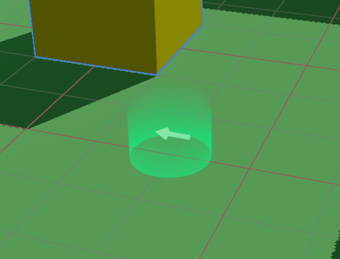
SpawnPoint
Specifies the point where players spawn in the world.
SpawnPoint sets the world-level spawn location. It is not intended to be used from within an item.
import { SpawnPoint } from '@xrift/world-components';

<SpawnPoint />
<SpawnPoint position={[0, 0, 5]} yaw={180} />
Props
| Prop | Type | Default | Description |
|---|---|---|---|
position | [number, number, number] | [0, 0, 0] | Spawn position |
yaw | number | 0 | Orientation at spawn (degrees 0-360) |
In the development environment, the spawn position and direction are visualized with a semi-transparent cylinder (gradient transparency from bottom to top) and an arrow. The helper is not displayed in the production build.
If multiple SpawnPoint components are placed, the one set last takes effect.
TextInput
A component that enables text input in 3D space. You can customize the appearance freely using the children method.
import { TextInput } from '@xrift/world-components';

<TextInput
  id="my-input"
  value={inputValue}
  onSubmit={handleSubmit}
  placeholder="Enter text..."
>
  <mesh>
    <boxGeometry args={[1, 0.5, 0.1]} />
    <meshStandardMaterial color="#333" />
  </mesh>
</TextInput>
Props
| Prop | Type | Default | Description |
|---|---|---|---|
id | string | - | Unique ID for the input field (Required) |
children | ReactNode | - | 3D object (Appearance) (Required) |
placeholder | string | - | Placeholder text |
maxLength | number | - | Maximum number of characters |
value | string | - | Current value |
onSubmit | (value: string) => void | - | Callback on input completion |
interactionText | string | 'Click to enter' | Text to display on interaction |
disabled | boolean | false | Whether to disable input |
Mechanism
The TextInput component operates with the following architecture:
- TextInput: Displays the 3D object passed as children as a clickable input field.
- Overlay Input: Upon clicking, a 2D text input UI is displayed as an overlay to accept actual input.
- XRiftContext Integration: world-components requests the overlay display via XRiftContext.
By passing any 3D object to children, you can freely customize the appearance of the input field. You can achieve button-like designs or looks that match the world's atmosphere.
The platform side uses the following APIs to implement TextInput behavior:
TextInputContextuseTextInputContextTextInputContextValueTextInputRequest
TagBoard
A component that handles tags selected by users locally/globally, providing a board UI (TagSelector) and tag display above each user's head (TagDisplay).
import { TagBoard } from '@xrift/world-components';

<TagBoard
  instanceStateKey="main-tag-board"
  position={[0, 1.5, -3]}
/>
Props
| Prop | Type | Default | Description |
|---|---|---|---|
tags | Tag[] | Default tag list | Tags to display/select |
columns | number | 3 | Number of display columns |
title | string | "Select Tag" | Title text |
instanceStateKey | string | - | Instance state key (Required, for identification when placing multiple boards) |
position | [number, number, number] | [0, 0, 0] | Position of the board |
rotation | [number, number, number] | [0, 0, 0] | Rotation of the board |
scale | number | 1 | Overall scale |
Tag Type Definition
interface Tag {
  id: string;      // Unique identifier for the tag
  label: string;   // Display label
  color: string;   // Color (HEX format)
}
Default Tag List
If the tags property is omitted, the following tags are used:
[
  { color: "#2ECC71", id: "want-talk", label: "Want to talk" },
  { color: "#3498DB", id: "want-listen", label: "Want to listen" },
  { color: "#95A5A6", id: "silent", label: "Silent" },
  { color: "#1ABC9C", id: "developer", label: "Developer" },
  { color: "#2980B9", id: "student", label: "Student" },
  { color: "#F1C40F", id: "beginner", label: "Beginner" },
  { color: "#9B59B6", id: "dont-know", label: "Don't know anything" },
  { color: "#8BC34A", id: "working", label: "Working" },
  { color: "#BF7B41", id: "away", label: "Away" },
  { color: "#FF9800", id: "cat", label: "Cat" },
]
Usage Example
Using Custom Tags
import { TagBoard, type Tag } from '@xrift/world-components';

const customTags: Tag[] = [
  { id: "frontend", label: "Frontend", color: "#61DAFB" },
  { id: "backend", label: "Backend", color: "#68A063" },
  { id: "design", label: "Design", color: "#FF6B6B" },
  { id: "pm", label: "PM", color: "#9B59B6" },
];

export const MyWorld = () => {
  return (
    <TagBoard
      tags={customTags}
      columns={2}
      title="What is your role?"
      instanceStateKey="role-tag-board"
      position={[0, 1.5, -3]}
      rotation={[0, 0, 0]}
      scale={1.2}
    />
  );
};
instanceStateKey must be unique within the same world. If placing multiple TagBoards, specify a different instanceStateKey for each.
UsersContextis required (used for retrieving user information).- Uses
useInstanceStatehook internally (synchronization of tag selection state).
DevEnvironment
A component that provides a local development environment. Used in the world template's dev.tsx.
DevEnvironment is for local preview when running npm run dev in a world development project. Do not use it inside actual world content such as World.tsx. It is also not used for item development (the item template uses its own dev.tsx).
import { DevEnvironment, XRiftProvider } from '@xrift/world-components'
import { World } from './World'
import xriftConfig from '../xrift.json'

createRoot(rootElement).render(
  <StrictMode>
    <XRiftProvider baseUrl="/">
      <DevEnvironment
        physicsConfig={xriftConfig.world?.physics}
        camera={{ near: xriftConfig.world?.camera?.near, far: xriftConfig.world?.camera?.far }}
      >
        <World />
      </DevEnvironment>
    </XRiftProvider>
  </StrictMode>
)
Props
| Prop | Type | Default | Description |
|---|---|---|---|
children | ReactNode | - | World content (Required) |
camera | { position?: [x, y, z]; fov?: number; near?: number; far?: number } | { fov: 50, near: 0.01, far: 1000 } | Camera settings |
moveSpeed | number | 5.0 | Movement speed |
shadows | boolean | true | Enable/disable shadows |
spawnPosition | [x, y, z] | [0.11, 1.6, 7.59] | Spawn position |
respawnThreshold | number | -10 | Y-coordinate threshold for respawn |
physicsConfig | PhysicsConfig | - | Physics settings |
CameraConfig
Clipping distances configurable via the camera prop. Corresponds to the world.camera settings in xrift.json.
| Prop | Type | Default | Description |
|---|---|---|---|
near | number | 0.01 | Near clipping distance |
far | number | 1000 | Far clipping distance |
PhysicsConfig
| Prop | Type | Default | Description |
|---|---|---|---|
gravity | number | 9.81 | Gravitational acceleration |
allowInfiniteJump | boolean | true | Allow infinite jumping |
Features
- First-Person Player: Physics-based WASD movement, jumping, and respawning
- View Controls: View manipulation via PointerLockControls
- Interaction: Raycasting to INTERACTABLE layer + click interaction
- Crosshair UI: Center-screen crosshair (highlights on hit)
- Guide UI: Pointer lock state guidance UI
- Controls Help UI: UI displaying control instructions
Controls
| Input | Description |
|---|---|
| Click | Start pointer lock / Interact |
| WASD / Arrow Keys | Movement |
| Space / E | Jump |
| ESC | Release pointer lock |
Installation of @react-three/rapier (^2.0.0) is required (optional peerDependency).
Portal
A component that displays a portal for moving to another instance. It consists of a swirl shader effect, destination thumbnail/world name/instance name/user count, particles, glow, and a clickable pedestal.
When instanceId is specified, it automatically fetches and displays information about the target instance. Clicking the pedestal triggers a confirmation modal (useConfirm) before transitioning to the target instance.
import { Portal } from '@xrift/world-components'

function MyWorld() {
  return (
    <Portal
      instanceId="ceffb128-23c7-4120-b4e6-19bf6c604c47"
      position={[5, 0, 0]}
      rotation={[0, Math.PI / 2, 0]}
    />
  )
}
Props
| Prop | Type | Default | Description |
|---|---|---|---|
instanceId | string | - | ID of the destination instance (Required) |
position | [number, number, number] | [0, 0, 0] | Position of the portal |
rotation | [number, number, number] | [0, 0, 0] | Rotation of the portal |
disabled | boolean | false | Disable portal navigation |
The instance ID is a UUID found in the instance page URL. For example, in https://app.xrift.net/instance/ceffb128-23c7-4120-b4e6-19bf6c604c47, the instance ID is ceffb128-23c7-4120-b4e6-19bf6c604c47.
Portal internally uses the useInstance hook to fetch instance information and handle navigation.
Skybox
Creates a gradient sky background.
import { Skybox } from '@xrift/world-components';

<Skybox topColor={0x87ceeb} bottomColor={0xffffff} />
Props
| Prop | Type | Default | Description |
|---|---|---|---|
topColor | number | 0x87ceeb | Top color |
bottomColor | number | 0xffffff | Bottom color |
offset | number | 0 | Gradient start position |
exponent | number | 1 | Gradient range |
Video180Sphere
A component that plays 180-degree VR video projected onto a hemisphere.
import { Video180Sphere } from '@xrift/world-components';

<Video180Sphere
  url="https://example.com/vr-video-180.mp4"
  position={[0, 1.5, 0]}
  radius={5}
  loop
/>
Props
| Prop | Type | Default | Description |
|---|---|---|---|
url | string | - | 180-degree video URL (Required) |
position | [number, number, number] | [0, 0, 0] | Position |
rotation | [number, number, number] | [0, 0, 0] | Rotation |
scale | number | [number, number, number] | - | Scale |
playing | boolean | true | Playing state |
muted | boolean | - | Muted state (set to true to bypass autoplay restrictions) |
volume | number | 1 | Volume (0-1) |
radius | number | - | Hemisphere radius |
segments | number | - | Geometry resolution (segment count) |
loop | boolean | - | Loop playback |
placeholderColor | string | 'black' | Placeholder color before video loads |
onEnded | () => void | - | Playback ended callback |
onLoadedMetadata | (event: { duration: number }) => void | - | Metadata loaded callback |
onProgress | (event: { currentTime: number }) => void | - | Progress update callback |
EntryLogBoard
Displays a log of user join/leave events in the instance.
import { EntryLogBoard } from '@xrift/world-components';

<EntryLogBoard
  position={[3, 1.5, -2]}
  rotation={[0, -0.5, 0]}
  maxEntries={10}
/>
Props
| Prop | Type | Default | Description |
|---|---|---|---|
stateNamespace | string | - | Instance state key (for multi-board identification) |
maxEntries | number | - | Maximum display entries |
formatTimestamp | (date: Date) => string | - | Timestamp format function |
displayNameFallback | string | - | Fallback when display name is unavailable |
labels | Partial<Labels> | - | Customize labels (join, leave) |
colors | Partial<Colors> | - | Customize colors (join, leave, background, text) |
position | [number, number, number] | [0, 0, 0] | Board position |
rotation | [number, number, number] | [0, 0, 0] | Board rotation |
scale | number | 1 | Overall scale |
onJoin | (entry: LogEntry) => void | - | Join event callback |
onLeave | (entry: LogEntry) => void | - | Leave event callback |
EntryLogBoard internally uses useInstanceEvent to receive user-joined/user-left events.
Hooks
useInstanceState
Synchronizes state across all users in the instance. It has the same interface as React's useState.
import { useInstanceState } from '@xrift/world-components';

function Counter() {
  const [count, setCount] = useInstanceState('counter', 0);

  return (
    <mesh onClick={() => setCount(count + 1)}>
      {/* count is synchronized across all users */}
    </mesh>
  );
}
Arguments
| Argument | Type | Description |
|---|---|---|
key | string | Unique identifier for the state |
initialValue | T | Initial value |
Return Value
[value: T, setValue: (newValue: T) => void] - Same format as useState
useInstanceEvent
A hook for sending and receiving instance events. You can receive platform events (user-joined, user-left) and send/receive custom world events.
import { useInstanceEvent } from '@xrift/world-components';

// Receive platform events (receive only, cannot emit)
useInstanceEvent('user-joined', (data) => {
  console.log('User joined:', data)
})

// Send and receive custom events
const emitReaction = useInstanceEvent('reaction', (data) => {
  console.log('Reaction received:', data)
})
emitReaction({ emoji: '👍', userId: 'user-1' })
Arguments
| Argument | Type | Description |
|---|---|---|
eventName | string | Event name |
callback | (data: T) => void | Callback when event is received |
Return Value
(data: T) => void - Event emit function. Returns a no-op for platform reserved events (user-joined, user-left).
Event Types
| Type | Event Name | Send | Receive | Description |
|---|---|---|---|---|
| Platform | user-joined | - | ✅ | User joined the instance |
| Platform | user-left | - | ✅ | User left the instance |
| Custom | Any string | ✅ | ✅ | World-specific events |
Use Cases
Reaction System
import { useInstanceEvent } from '@xrift/world-components';
import { useCallback, useState } from 'react';

function ReactionSystem() {
  const [reactions, setReactions] = useState<{ emoji: string }[]>([]);

  const emitReaction = useInstanceEvent('reaction', (data: { emoji: string }) => {
    setReactions(prev => [...prev, data]);
  });

  const sendReaction = useCallback((emoji: string) => {
    emitReaction({ emoji });
  }, [emitReaction]);

  return (
    <mesh onClick={() => sendReaction('👍')}>
      <boxGeometry args={[1, 1, 0.2]} />
      <meshStandardMaterial color="yellow" />
    </mesh>
  );
}
Join/Leave Detection
import { useInstanceEvent } from '@xrift/world-components';

function JoinLeaveNotifier() {
  useInstanceEvent('user-joined', (data) => {
    console.log('User joined:', data);
  });

  useInstanceEvent('user-left', (data) => {
    console.log('User left:', data);
  });

  return null;
}
- useInstanceEvent: Best for transient event notifications (reactions, effect triggers, etc.).
- useInstanceState: Best for persistent synchronized state (counters, ON/OFF states, etc.).
In the development environment, a local EventEmitter is used, so events are only sent and received within the same browser. In production, the platform injects a WebSocket implementation, and events are shared across all users in the instance.
useScreenShareContext
A hook to retrieve the state of screen sharing.
import { useScreenShareContext } from '@xrift/world-components';

function MyComponent() {
  const { videoElement, isSharing, startScreenShare, stopScreenShare } = useScreenShareContext();

  return (
    <button onClick={isSharing ? stopScreenShare : startScreenShare}>
      {isSharing ? 'Stop Sharing' : 'Start Sharing'}
    </button>
  );
}
Return Value
| Property | Type | Description |
|---|---|---|
videoElement | HTMLVideoElement | null | Video element to display |
isSharing | boolean | Whether the user is sharing |
startScreenShare | () => void | Start sharing |
stopScreenShare | () => void | Stop sharing |
useSpawnPoint
A hook for the platform side to retrieve spawn point information.
import { useSpawnPoint } from '@xrift/world-components';

function MyPlatform() {
  const spawnPoint = useSpawnPoint();
  // spawnPoint: { position: [x, y, z], yaw: number }
}
Return Value
| Property | Type | Description |
|---|---|---|
position | [number, number, number] | Spawn position |
yaw | number | Orientation at spawn (degrees) |
This hook is intended for use on the xrift-frontend (platform) side. World developers should use the SpawnPoint component.
useUsers
A hook to retrieve information and location of users participating in the world. You can access information about yourself (local user) and other participants (remote users).
import { useUsers } from '@xrift/world-components';

function ParticipantCount() {
  const { localUser, remoteUsers, getMovement, getLocalMovement } = useUsers();

  const totalCount = (localUser ? 1 : 0) + remoteUsers.length;

  return (
    <div>
      <p>Participants: {totalCount}</p>
    </div>
  );
}
Return Value
| Property | Type | Description |
|---|---|---|
localUser | User | null | Information about yourself |
remoteUsers | User[] | Array of information about other participants |
getMovement | (id: string) => PlayerMovement | undefined | Retrieve location information of a specific user |
getLocalMovement | () => PlayerMovement | Retrieve your own location information |
getAvatarHeight? | (id: string) => AvatarHeight | undefined | Retrieve avatar height information of a specific user |
getLocalAvatarHeight? | () => AvatarHeight | Retrieve your own avatar height information |
User Type
interface User {
  id: string;              // User ID
  displayName: string;     // Display name
  userIconUrl: string | null; // Avatar icon URL
  isGuest: boolean;        // Whether the user is a guest
}
PlayerMovement Type
interface PlayerMovement {
  position: { x: number; y: number; z: number };
  direction: { x: number; z: number };
  horizontalSpeed: number;
  verticalSpeed: number;
  rotation: { yaw: number; pitch: number };
  isGrounded: boolean;
  isJumping: boolean;
  isInVR?: boolean;
  vrTracking?: VRTrackingData;
}
AvatarHeight Type
interface AvatarHeight {
  height: number;    // Full height of the avatar (meters)
  eyeHeight: number; // Height from ground to the avatar's eye position (meters)
}
If the platform does not implement getAvatarHeight / getLocalAvatarHeight, default values of height: 1.5 and eyeHeight: 1.35 are returned. Since these are optional properties, use optional chaining (?.) when calling them.
Retrieving Position in useFrame
getMovement() and getLocalMovement() can be called every frame within useFrame. These functions allow retrieving the latest position information without triggering re-renders.
import { useUsers } from '@xrift/world-components';
import { useFrame } from '@react-three/fiber';
import { useRef } from 'react';
import { Group } from 'three';

function FollowCamera() {
  const groupRef = useRef<Group>(null);
  const { getLocalMovement } = useUsers();

  useFrame(() => {
    const movement = getLocalMovement();
    if (!groupRef.current) return;

    // Place an object slightly above your position
    groupRef.current.position.set(
      movement.position.x,
      movement.position.y + 3,
      movement.position.z
    );
  });

  return (
    <group ref={groupRef}>
      <pointLight intensity={1} />
    </group>
  );
}
Use Cases
Display HUD above User's Head
import { useUsers } from '@xrift/world-components';
import { useFrame } from '@react-three/fiber';
import { useRef } from 'react';
import { Group } from 'three';
import { Text } from '@react-three/drei';

function UserHUD({ user, getMovement, getAvatarHeight }) {
  const groupRef = useRef<Group>(null);

  useFrame(() => {
    const movement = getMovement(user.id);
    if (!movement || !groupRef.current) return;

    // Get the avatar's height and place HUD above the head
    const avatarHeight = getAvatarHeight?.(user.id);
    const headOffset = (avatarHeight?.height ?? 1.5) + 0.2;

    groupRef.current.position.set(
      movement.position.x,
      movement.position.y + headOffset,
      movement.position.z
    );
  });

  return (
    <group ref={groupRef}>
      <Text fontSize={0.2}>{user.displayName}</Text>
    </group>
  );
}

function UserHUDs() {
  const { remoteUsers, getMovement, getAvatarHeight } = useUsers();

  return (
    <>
      {remoteUsers.map(user => (
        <UserHUD key={user.id} user={user} getMovement={getMovement} getAvatarHeight={getAvatarHeight} />
      ))}
    </>
  );
}
Detect Nearby Users
import { useUsers } from '@xrift/world-components';
import { useFrame } from '@react-three/fiber';
import { useState } from 'react';

function ProximityDetector() {
  const { remoteUsers, getMovement, getLocalMovement } = useUsers();
  const [nearbyUsers, setNearbyUsers] = useState<string[]>([]);

  useFrame(() => {
    const myPos = getLocalMovement().position;
    const nearby: string[] = [];

    remoteUsers.forEach(user => {
      const movement = getMovement(user.id);
      if (!movement) return;

      const distance = Math.sqrt(
        Math.pow(myPos.x - movement.position.x, 2) +
        Math.pow(myPos.y - movement.position.y, 2) +
        Math.pow(myPos.z - movement.position.z, 2)
      );

      if (distance < 5) {
        nearby.push(user.displayName);
      }
    });

    // Update only if the array content changes
    if (JSON.stringify(nearby) !== JSON.stringify(nearbyUsers)) {
      setNearbyUsers(nearby);
    }
  });

  return null;
}
Calculate Distance Between Users
import { useUsers } from '@xrift/world-components';
import { useFrame } from '@react-three/fiber';
import { useRef } from 'react';
import { Line } from '@react-three/drei';

function DistanceLine({ targetUser, getMovement, getLocalMovement }) {
  const lineRef = useRef<any>(null);

  useFrame(() => {
    const myPos = getLocalMovement().position;
    const targetMovement = getMovement(targetUser.id);
    if (!targetMovement || !lineRef.current) return;

    lineRef.current.geometry.setPositions([
      myPos.x, myPos.y + 1, myPos.z,
      targetMovement.position.x, targetMovement.position.y + 1, targetMovement.position.z
    ]);
  });

  return (
    <Line
      ref={lineRef}
      points={[[0, 0, 0], [0, 0, 0]]}
      color="yellow"
      lineWidth={2}
    />
  );
}
getMovement() and getLocalMovement() are safe to call every frame within useFrame. They return internally cached values, so the performance impact is minimal.
The remoteUsers array is updated only when users join or leave. Changes in user positions do not trigger re-renders. Always use getMovement() to retrieve position information.
useTeleport
A hook for teleporting your own avatar to a specified position. Supports use cases such as portals, elevators, and warp zones.
import { useTeleport } from '@xrift/world-components';

function MyComponent() {
  const { teleport } = useTeleport();

  const handleTeleport = useCallback(() => {
    teleport({ position: [50, 0, 30], yaw: 180 });
  }, [teleport]);
}
API
interface TeleportDestination {
  position: [number, number, number]
  yaw?: number // Degrees (0-360). Maintains current orientation when omitted
}

const { teleport } = useTeleport()
Parameters (TeleportDestination)
| Parameter | Type | Required | Description |
|---|---|---|---|
position | [number, number, number] | Yes | Teleport destination coordinates [x, y, z] |
yaw | number | No | Orientation after teleport (degrees 0-360). Maintains current orientation when omitted |
Usage Example
Teleport with a Portal
import { useTeleport, Interactable } from '@xrift/world-components'
import { useCallback } from 'react'

function MyWorld() {
  const { teleport } = useTeleport()

  const handlePortal = useCallback(() => {
    teleport({ position: [50, 0, 30], yaw: 180 })
  }, [teleport])

  return (
    <Interactable id="portal" onInteract={handlePortal}>
      <mesh>
        <torusGeometry />
        <meshStandardMaterial color="purple" />
      </mesh>
    </Interactable>
  )
}
When yaw is omitted, the player's current orientation is maintained after teleporting. Only specify it when you want the player to face a specific direction.
useConfirm
A hook for displaying a confirmation modal to the user. Use it to ask for confirmation before important actions such as world navigation.
import { useConfirm } from '@xrift/world-components';

function MyComponent() {
  const { requestConfirm } = useConfirm();

  const handleAction = async () => {
    const ok = await requestConfirm({ message: 'Move to another world?' });
    if (ok) {
      // Proceed with the action
    }
  };
}
Returns
| Property | Type | Description |
|---|---|---|
requestConfirm | (options: ConfirmOptions) => Promise<boolean> | Display a confirmation modal and return the result |
ConfirmOptions
| Property | Type | Required | Description |
|---|---|---|---|
message | string | Yes | Message displayed to the user |
title | string | No | Dialog title |
confirmLabel | string | No | Label for the confirm button |
cancelLabel | string | No | Label for the cancel button |
Usage Example
Confirm before navigating to an external site
import { useConfirm, Interactable } from '@xrift/world-components'

function ExternalLink() {
  const { requestConfirm } = useConfirm()

  const handleClick = async () => {
    const ok = await requestConfirm({
      title: 'Navigate to external site',
      message: 'You are about to leave this world. Continue?',
      confirmLabel: 'Go',
      cancelLabel: 'Cancel',
    })
    if (ok) {
      window.open('https://example.com', '_blank')
    }
  }

  return (
    <Interactable id="external-link" onInteract={handleClick}>
      <mesh>
        <boxGeometry args={[1, 1, 0.2]} />
        <meshStandardMaterial color="cyan" />
      </mesh>
    </Interactable>
  )
}
On mobile browsers like iPhone, window.open and external site navigation are blocked unless triggered by a user gesture. By using useConfirm to display a confirmation dialog, you create a user-gesture event chain that allows navigation to proceed without being blocked.
The Portal component internally uses useConfirm via the useInstance hook. When using Portal, you don't need to call useConfirm directly.
useInstance
A hook that provides instance information retrieval and navigation with confirmation. It internally uses useConfirm to display a confirmation modal before navigation.
import { useInstance } from '@xrift/world-components'

function MyComponent() {
  const { info, navigateWithConfirm } = useInstance('target-instance-id')

  if (!info) return null

  return (
    <mesh onClick={navigateWithConfirm}>
      {/* Instance name: {info.name} */}
    </mesh>
  )
}
Arguments
| Argument | Type | Description |
|---|---|---|
instanceId | string | ID of the instance to retrieve |
Return Value
| Property | Type | Description |
|---|---|---|
info | InstanceInfo | null | Instance information (null before fetching) |
navigateWithConfirm | () => Promise<void> | Navigate to instance with confirmation modal |
InstanceInfo Type
| Field | Type | Description |
|---|---|---|
id | string | Instance ID |
name | string | Instance name |
description | string | null | Description |
currentUsers | number | Current number of users |
maxCapacity | number | Maximum capacity |
isPublic | boolean | Whether it is public |
allowGuests | boolean | Whether guests are allowed |
owner | { id, displayName, userIconUrl? } | Owner information (optional) |
world | WorldInfo | Information about the world it belongs to |
useWorld
A hook that provides world information retrieval.
import { useWorld } from '@xrift/world-components'

function MyComponent() {
  const { info } = useWorld('target-world-id')

  if (!info) return null

  return (
    <mesh>
      {/* World name: {info.name} */}
    </mesh>
  )
}
Arguments
| Argument | Type | Description |
|---|---|---|
worldId | string | ID of the world to retrieve |
Return Value
| Property | Type | Description |
|---|---|---|
info | WorldInfo | null | World information (null before fetching) |
WorldInfo Type
| Field | Type | Description |
|---|---|---|
id | string | World ID |
name | string | World name |
description | string | null | Description |
thumbnailUrl | string | null | Thumbnail URL |
isPublic | boolean | Whether it is public |
instanceCount | number | Number of instances |
totalVisitCount | number | Total visit count |
uniqueVisitorCount | number | Unique visitor count |
favoriteCount | number | Favorite count |
owner | { id, displayName, userIconUrl? } | Owner information (optional) |
permissions | { allowedDomains: string[], allowedCodeRules: string[] } | undefined | Permissions required by the world (details) |
useVoiceVolumeOverride
A hook for overriding specific users' voice chat volume. Used for stages or podiums where a speaker's voice should reach everyone.
import { useVoiceVolumeOverride } from '@xrift/world-components';

function StagePodium() {
  const { setOverride, clearOverride } = useVoiceVolumeOverride();

  // Amplify speaker's voice to all
  const handleEnter = (userId: string) => {
    setOverride(userId, 1.0);
  };
  const handleLeave = (userId: string) => {
    clearOverride(userId);
  };
}
Return Value
| Property | Type | Description |
|---|---|---|
setOverride | (userId: string, volume: number) => void | Set volume override for a user |
clearOverride | (userId: string) => void | Clear volume override for a user |
clearAll | () => void | Clear all overrides |
getOverrides | () => ReadonlyMap<string, number> | Get current overrides |
Renamed from useAudioVolume to useVoiceVolumeOverride in v0.34.0. The old name is still available as @deprecated but migration to the new name is recommended.
useFileInput
A hook for displaying a file picker dialog. Allows opening a browser file picker (with drag & drop overlay UI) triggered by clicking a 3D object.
import { useFileInput } from '@xrift/world-components';

function MyComponent() {
  const { requestFileInput } = useFileInput();

  const handleClick = () => {
    requestFileInput({
      id: 'avatar-upload',
      accept: '.vrm',
      maxSize: 30 * 1024 * 1024,
      onSelect: (files) => console.log('Selected:', files),
    });
  };
}
Return Value
| Property | Type | Description |
|---|---|---|
requestFileInput | (request: FileInputRequest) => void | Display the file picker dialog |
FileInputRequest
| Property | Type | Required | Description |
|---|---|---|---|
id | string | Yes | Unique identifier for the input |
accept | string | No | Accepted file types (e.g. '.vrm', 'image/*') |
multiple | boolean | No | Allow multiple file selection |
maxSize | number | No | Maximum file size in bytes |
onSelect | (files: File[]) => void | Yes | Callback when files are selected |
onCancel | () => void | No | Callback when cancelled |
onError | (error: FileInputError) => void | No | Callback on error |
FileInputError
| Property | Type | Description |
|---|---|---|
type | 'file_too_large' | 'invalid_type' | Error type |
message | string | Error message |
Usage Examples
VRM File Upload
import { useFileInput, Interactable } from '@xrift/world-components'
import { useState } from 'react'

function AvatarUploader() {
  const { requestFileInput } = useFileInput()
  const [fileName, setFileName] = useState('')

  const handleClick = () => {
    requestFileInput({
      id: 'avatar-upload',
      accept: '.vrm',
      maxSize: 30 * 1024 * 1024, // 30MB
      onSelect: (files) => {
        setFileName(files[0].name)
        // Upload file...
      },
      onError: (error) => {
        console.error(error.message)
      },
    })
  }

  return (
    <Interactable id="upload-button" onInteract={handleClick} interactionText="Change Avatar">
      <mesh>
        <boxGeometry args={[1, 0.5, 0.1]} />
        <meshStandardMaterial color="#7b2d8b" />
      </mesh>
    </Interactable>
  )
}
The file picker overlay also supports drag & drop. Users can either click to browse for files or drag files onto the drop zone.
When a file input is requested during a VR session, the VR session is automatically ended before the file picker is displayed.
useSharedFile
A hook for uploading and listing shared files within an instance. Allows uploading images and documents from within the 3D space for sharing with other users.
import { useSharedFile } from '@xrift/world-components';

function MyComponent() {
  const { uploadSharedFile, getSharedFiles } = useSharedFile();

  const handleUpload = async (file: File) => {
    const result = await uploadSharedFile(file, (progress) => {
      console.log(`${progress}%`);
    });
    console.log('URL:', result.publicUrl);
  };
}
Return Value
| Property | Type | Description |
|---|---|---|
uploadSharedFile | (file: File, onProgress?: (progress: number) => void) => Promise<SharedFileInfo> | Upload a file |
getSharedFiles | () => Promise<SharedFileInfo[]> | Get the list of shared files |
SharedFileInfo
| Property | Type | Description |
|---|---|---|
id | string | Unique file ID |
fileName | string | File name |
contentType | string | MIME type |
fileSize | number | File size in bytes |
publicUrl | string | Public URL |
createdAt | string | Creation date (ISO 8601) |
Usage Examples
Upload Images and List Files
import { useSharedFile, useFileInput, Interactable } from '@xrift/world-components'
import { useCallback, useState } from 'react'

function SharedFileUploader() {
  const { uploadSharedFile, getSharedFiles } = useSharedFile()
  const { requestFileInput } = useFileInput()
  const [status, setStatus] = useState('')

  const handleUpload = useCallback(() => {
    requestFileInput({
      id: 'shared-file-upload',
      accept: 'image/*',
      maxSize: 10 * 1024 * 1024, // 10MB
      onSelect: async (files) => {
        const file = files[0]
        if (!file) return
        try {
          const result = await uploadSharedFile(file, (progress) => {
            setStatus(`Uploading: ${progress}%`)
          })
          setStatus(`Done: ${result.fileName}`)
        } catch (e) {
          setStatus(`Error: ${e instanceof Error ? e.message : String(e)}`)
        }
      },
    })
  }, [requestFileInput, uploadSharedFile])

  const handleList = useCallback(async () => {
    const files = await getSharedFiles()
    setStatus(`${files.length} files`)
  }, [getSharedFiles])

  return (
    <>
      <Interactable id="upload-btn" onInteract={handleUpload} interactionText="Upload">
        <mesh>
          <boxGeometry args={[1, 0.5, 0.1]} />
          <meshStandardMaterial color="#d4a017" />
        </mesh>
      </Interactable>
      <Interactable id="list-btn" onInteract={handleList} interactionText="List Files">
        <mesh position={[1.5, 0, 0]}>
          <boxGeometry args={[1, 0.5, 0.1]} />
          <meshStandardMaterial color="#c47f17" />
        </mesh>
      </Interactable>
    </>
  )
}
useItem
A hook that retrieves the unique ID of a placed item. Even when the same item is placed multiple times, each placement returns a different ID.
import { useItem } from '@xrift/world-components';

function MyItem() {
  const { id } = useItem();
  // id is unique per placement
}
Returns
| Property | Type | Description |
|---|---|---|
id | string | Unique ID of the placed object (UUID) |
Note: useItem can only be used within an ItemProvider. Calling it outside the provider will throw an error. The platform automatically provides the ItemProvider, so item developers do not need to set up the provider themselves.
Per-placement state management
import { useItem, useInstanceState } from '@xrift/world-components';

function VotingBox() {
  const { id } = useItem();
  const [votes, setVotes] = useInstanceState(`votes-${id}`, 0);

  return (
    <Interactable id={`vote-${id}`} onInteract={() => setVotes(votes + 1)}>
      <mesh>
        <boxGeometry args={[1, 1, 0.2]} />
        <meshStandardMaterial color="green" />
      </mesh>
    </Interactable>
  );
}
Constants
LAYERS
Constants utilizing Three.js's layer system. Used for configuring layers on cameras and Raycasters.
import { LAYERS } from '@xrift/world-components';
| Constant | Value | Description |
|---|---|---|
LAYERS.DEFAULT | 0 | Default layer (all objects belong to this layer initially) |
LAYERS.FIRST_PERSON_ONLY | 9 | First-person view only (for VRMFirstPerson) |
LAYERS.THIRD_PERSON_ONLY | 10 | Third-person view only (for VRMFirstPerson) |
LAYERS.INTERACTABLE | 11 | Interactable objects (Raycast targets) |
Related Types
type LayerName = 'DEFAULT' | 'FIRST_PERSON_ONLY' | 'THIRD_PERSON_ONLY' | 'INTERACTABLE';
type LayerNumber = 0 | 9 | 10 | 11;
Use Cases
- Setting layers for detecting interaction targets with Raycaster
- Switching between first-person/third-person views in VR mode